How to Optimize Images for Web Performance Without Losing Quality
AI Search & Quick Summary
Key Takeaway: A complete guide to image optimization for web performance: WebP vs JPEG vs AVIF, lazy loading, responsive images, compression tools, and a practical optimization checklist.
Why Image Optimization Matters for Your Website
Images account for roughly 50% of a typical web page's total size. According to HTTP Archive data from 2026, the median web page loads over 1.8MB of images alone. If these images are unoptimized, your website becomes sluggish, your bounce rate climbs, and your search engine rankings suffer.
Google's Core Web Vitals — specifically Largest Contentful Paint (LCP) — directly measures how quickly your largest image loads. Sites that fail LCP receive a ranking penalty. The good news? Image optimization is one of the easiest performance wins you can achieve.
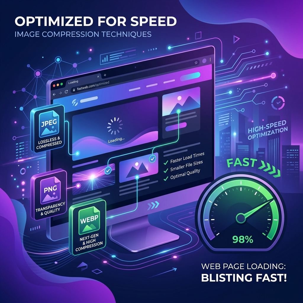
Understanding Image Formats in 2026
JPEG (JPG)
JPEG remains the workhorse of web photography. It uses lossy compression, meaning it discards some visual data to achieve smaller file sizes. For photographs and complex images with many colors, JPEG offers an excellent balance of quality and size.
- Best for: Photographs, hero images, product shots
- Compression: Lossy (adjustable quality 1-100)
- Transparency: Not supported
- Typical savings: 60-80% reduction at quality 80
PNG
PNG uses lossless compression, preserving every pixel of the original image. This makes it ideal for graphics with sharp edges, text overlays, logos, and any image requiring transparency.
- Best for: Logos, icons, screenshots, graphics with text
- Compression: Lossless
- Transparency: Full alpha channel support
- File size: 2-5x larger than equivalent JPEG
WebP — The Modern Standard
Developed by Google, WebP supports both lossy and lossless compression, transparency, and animation — essentially combining the best features of JPEG, PNG, and GIF into one format. In 2026, WebP is supported by 97% of browsers globally.
- Best for: Everything — it is the default recommended format
- Compression: Both lossy and lossless
- Savings vs JPEG: 25-35% smaller at equivalent quality
- Savings vs PNG: 26% smaller for lossless
AVIF — The Next Generation
AVIF (AV1 Image File Format) offers even better compression than WebP — typically 20% smaller at the same visual quality. However, browser support is at approximately 92% in 2026, and encoding is significantly slower.
- Best for: High-traffic sites where every kilobyte matters
- Browser support: ~92% (no IE11, partial Safari)
- Encoding speed: 5-10x slower than WebP
Implementing Lazy Loading
Lazy loading delays the loading of images that are not visible in the viewport until the user scrolls to them. This dramatically improves initial page load time because the browser only downloads what the user can actually see.
The simplest implementation uses the native HTML attribute:
<img src="photo.webp" loading="lazy" alt="Description">
This single attribute tells the browser to defer loading the image until it is near the viewport. No JavaScript library required. For hero images and above-the-fold content, use loading="eager" (or simply omit the attribute) to ensure they load immediately.
Responsive Images with srcset
Serving a 2000px wide image to a mobile phone with a 375px screen is wasteful. The srcset attribute lets you provide multiple image sizes, and the browser automatically selects the most appropriate one:
This approach can reduce mobile image downloads by 60-70% compared to serving desktop-sized images to all devices.
Compression Tools and Techniques
Online Tools
- Squoosh (by Google): Browser-based, supports all formats, side-by-side comparison
- TinyPNG: Excellent for PNG and JPEG batch compression
- QuickRectify Image Tools: Browser-based processing with no upload required
Build-Time Optimization
For developers, integrating image optimization into your build process ensures every image is automatically compressed before deployment:
- Vite: Use vite-plugin-image-optimizer
- Next.js: Built-in Image component with automatic optimization
- Webpack: image-minimizer-webpack-plugin
CDN-Level Optimization
Modern CDNs like Cloudflare, Vercel, and AWS CloudFront can automatically convert and resize images on the fly. This is the most hands-off approach — upload your original high-quality images, and the CDN serves optimized versions based on the requesting device.
Image Optimization Checklist
- Convert all photographs to WebP format
- Keep logos and icons as SVG (vector) or optimized PNG
- Add
loading="lazy"to all below-fold images - Use
srcsetto serve responsive image sizes - Set explicit
widthandheightattributes to prevent layout shift - Compress images to 80% quality for lossy formats
- Use a CDN for automatic format conversion and caching
- Add descriptive
alttext for accessibility and SEO
Real-World Impact
Here are typical results from optimizing a mid-size website's images:
- Homepage load time: 4.2s → 1.8s (57% improvement)
- Total page weight: 3.1MB → 890KB (71% reduction)
- LCP score: 3.8s → 1.4s (moved from "Needs Improvement" to "Good")
- Mobile bounce rate: 45% → 28% (38% improvement)
Frequently Asked Questions
What is the best image format for web in 2026?
WebP is the best all-around format for web images in 2026. It offers superior compression to both JPEG and PNG, supports transparency and animation, and has 97% browser support. Use AVIF for cutting-edge optimization on high-traffic sites.
How do I reduce image size without losing quality?
Use lossless compression tools like Squoosh or TinyPNG. For photos, JPEG/WebP at quality 80-85 produces files 60-70% smaller with virtually no visible quality difference. Always keep your original high-resolution files as backups.
What is lazy loading and should I use it?
Lazy loading delays image downloads until the user scrolls near them. You should use it on all images below the fold. Add loading="lazy" to your img tags — it is a native HTML feature requiring zero JavaScript. Do not lazy-load your hero image or any above-the-fold content.
What are the ideal image dimensions for web?
Hero images: 1920x1080px (desktop), 768x1024px (tablet), 375x667px (mobile). Blog thumbnails: 800x450px. Product images: 1000x1000px. Always use srcset to serve appropriate sizes per device. Never serve images wider than the container they appear in.

About the Author: Rahul Das
Tech Enthusiast, Software Developer, and Content Creator. Passionate about building scalable web applications and sharing practical knowledge to help students and professionals grow in their tech careers.
Related Articles
How to Convert PDF to Word Without Losing Formatting (100% Free)
Struggling with broken layouts? Learn the exact methods to convert PDF files to Word documents while perfectly preserving fonts, images, tables, and spacing.

Top 10 PDF Tools Every Student Needs in 2026: The Complete Guide
Discover the top 10 PDF tools every student needs in 2026 — from merging lecture notes to OCR scanning textbooks, with real use cases for every student type and all available free.
How to Merge PDF Files for Free in 2026: 5 Methods Compared
Compare five proven methods to merge PDF files for free in 2026 — browser-based tools, Adobe, Mac Preview, command line, and tips for password-protected files and batch merging.
Enjoyed this article?
Subscribe to our newsletter for more insights, tutorials, and industry updates delivered directly to your inbox.